
An opportunity to design for a Canadian Icon. There are few feelings that warm my heart more than seeing past design work in the wild — none more than the work I contributed to for The Terry Fox Foundation.
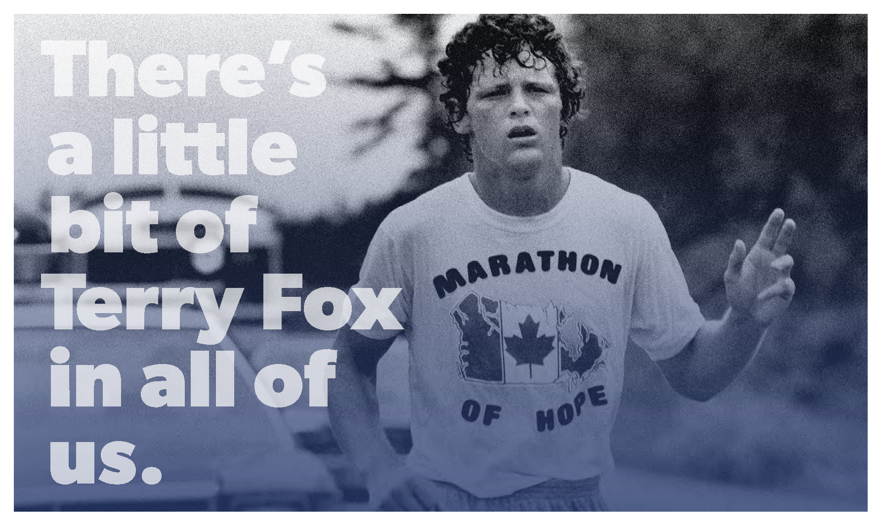
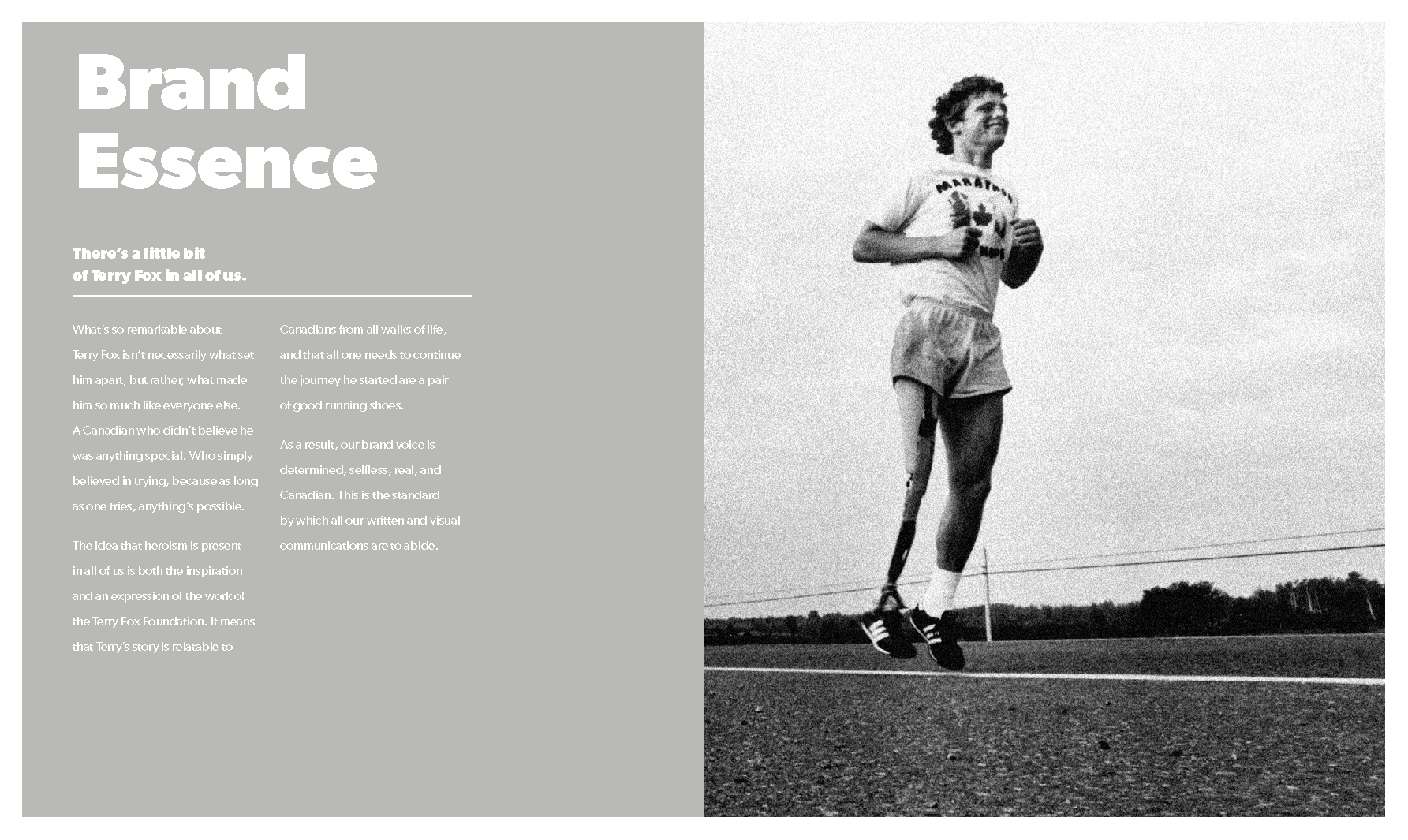
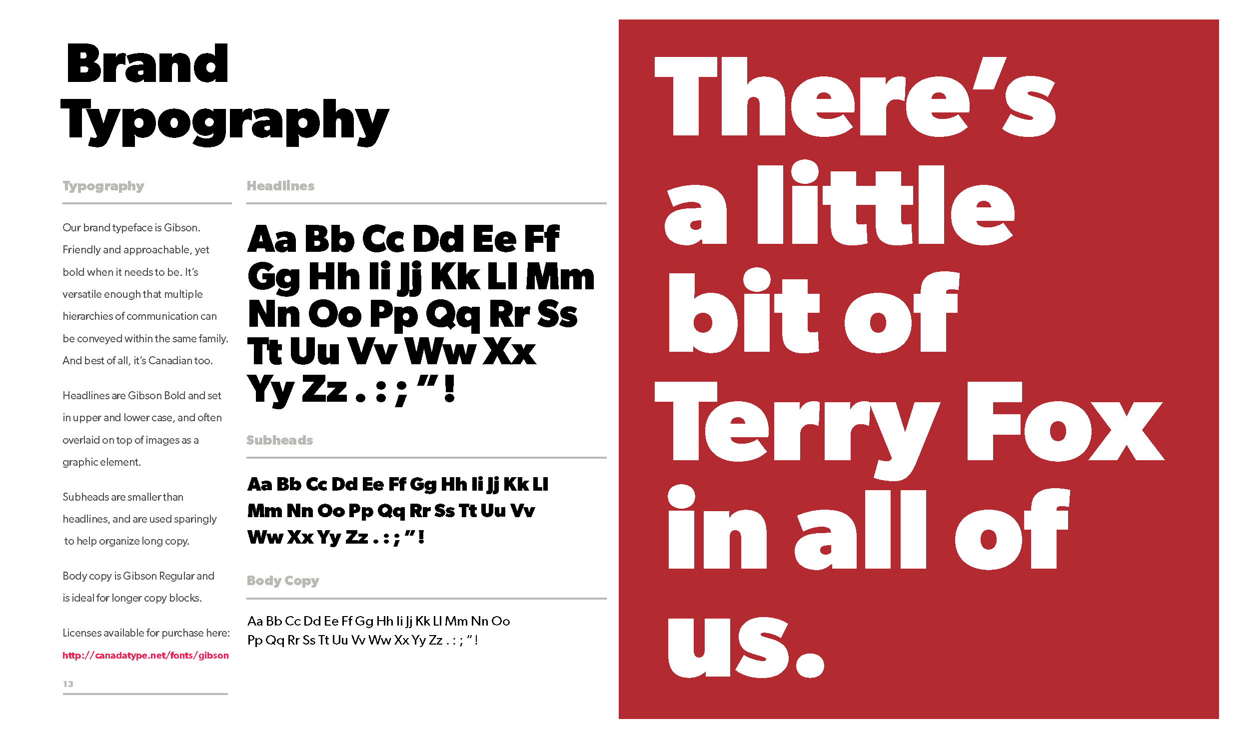
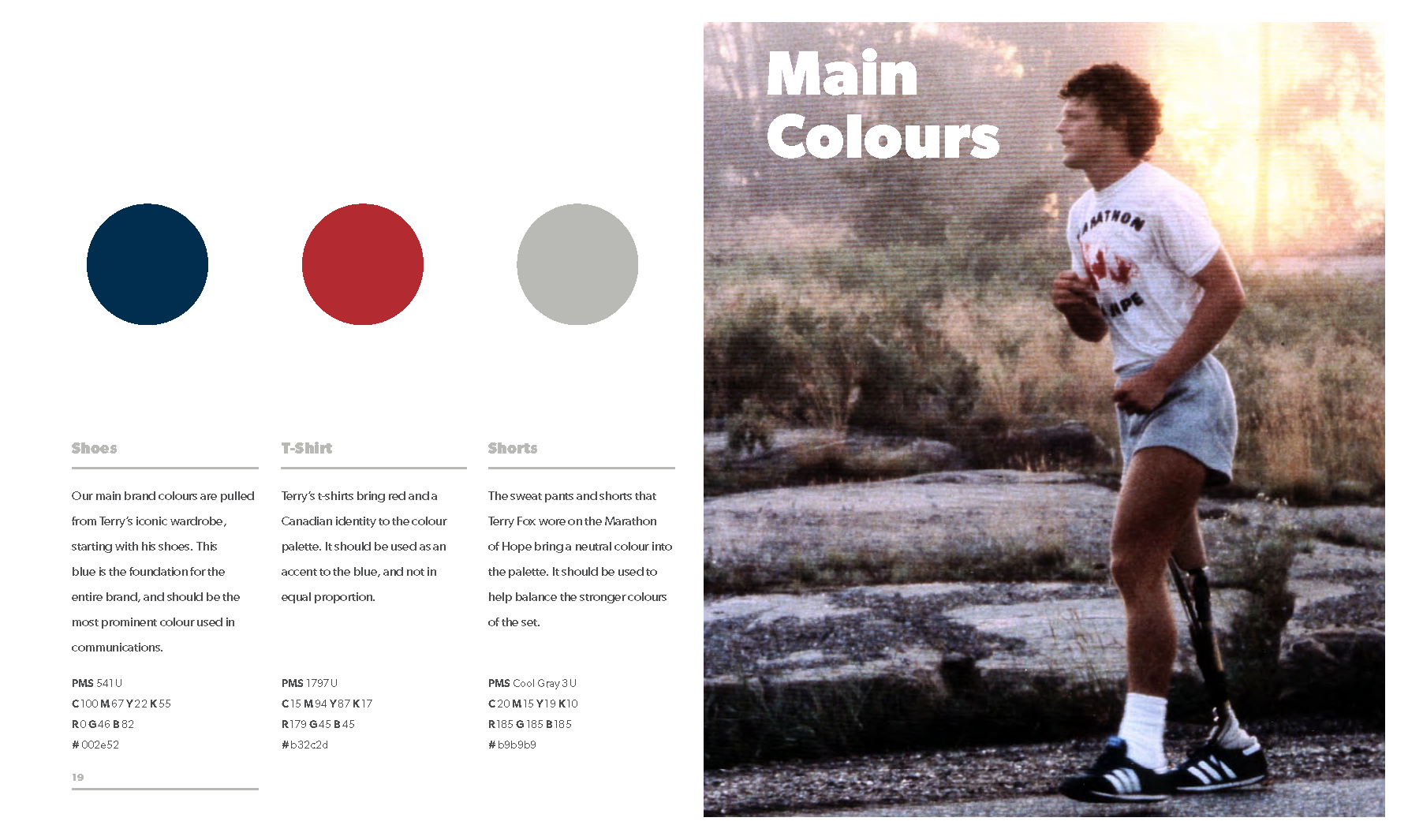
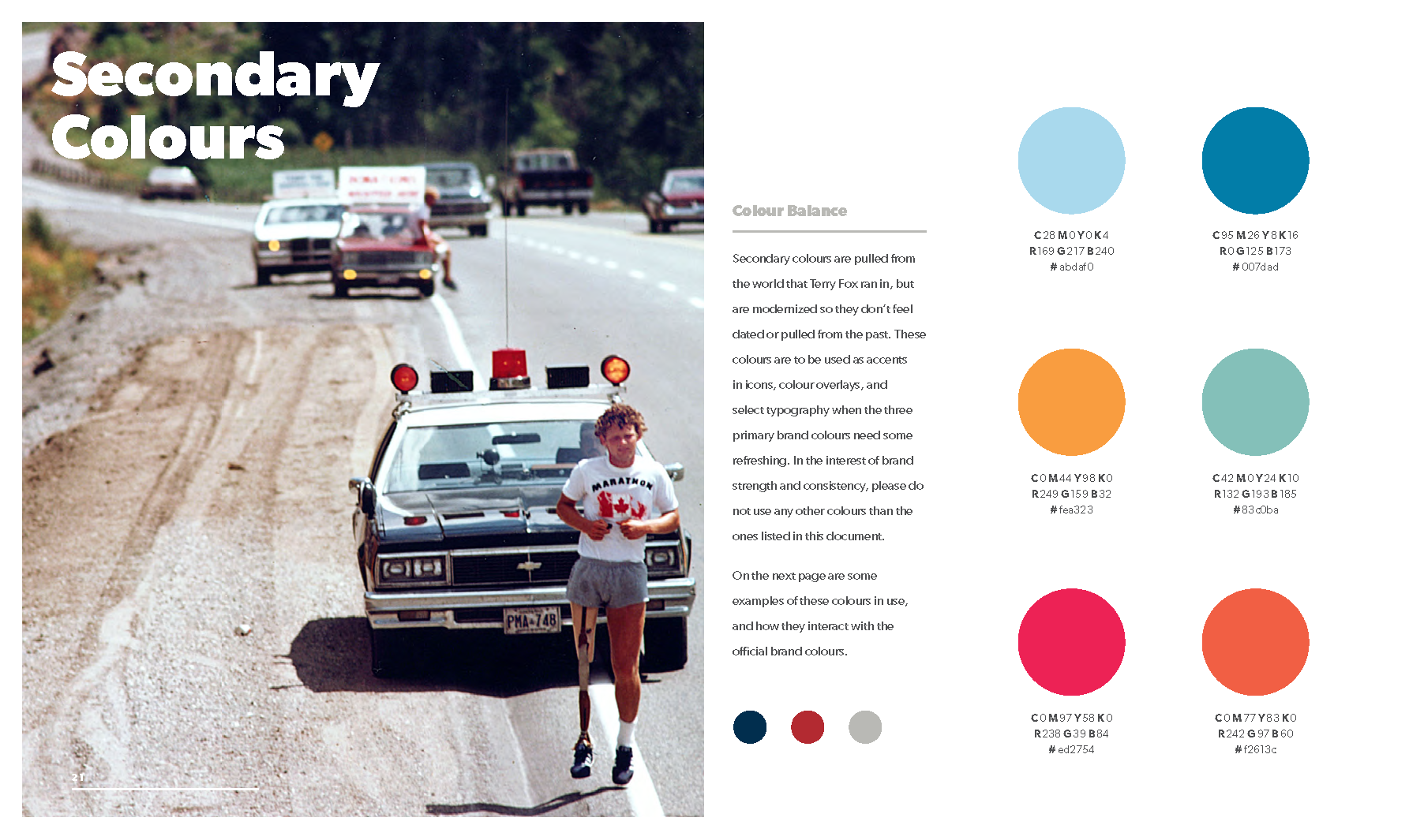
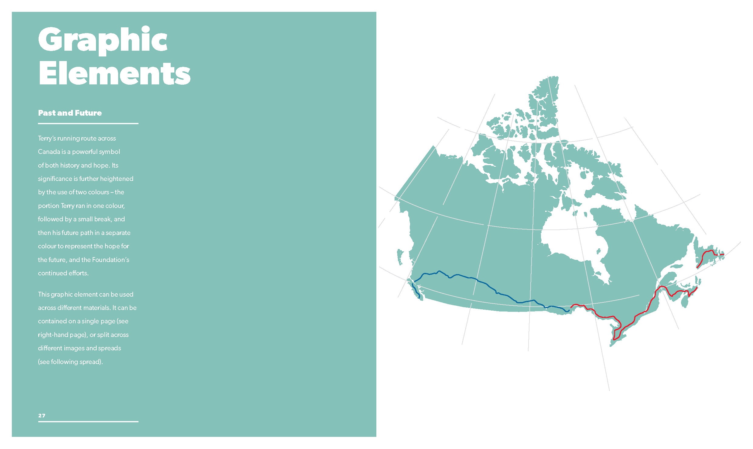
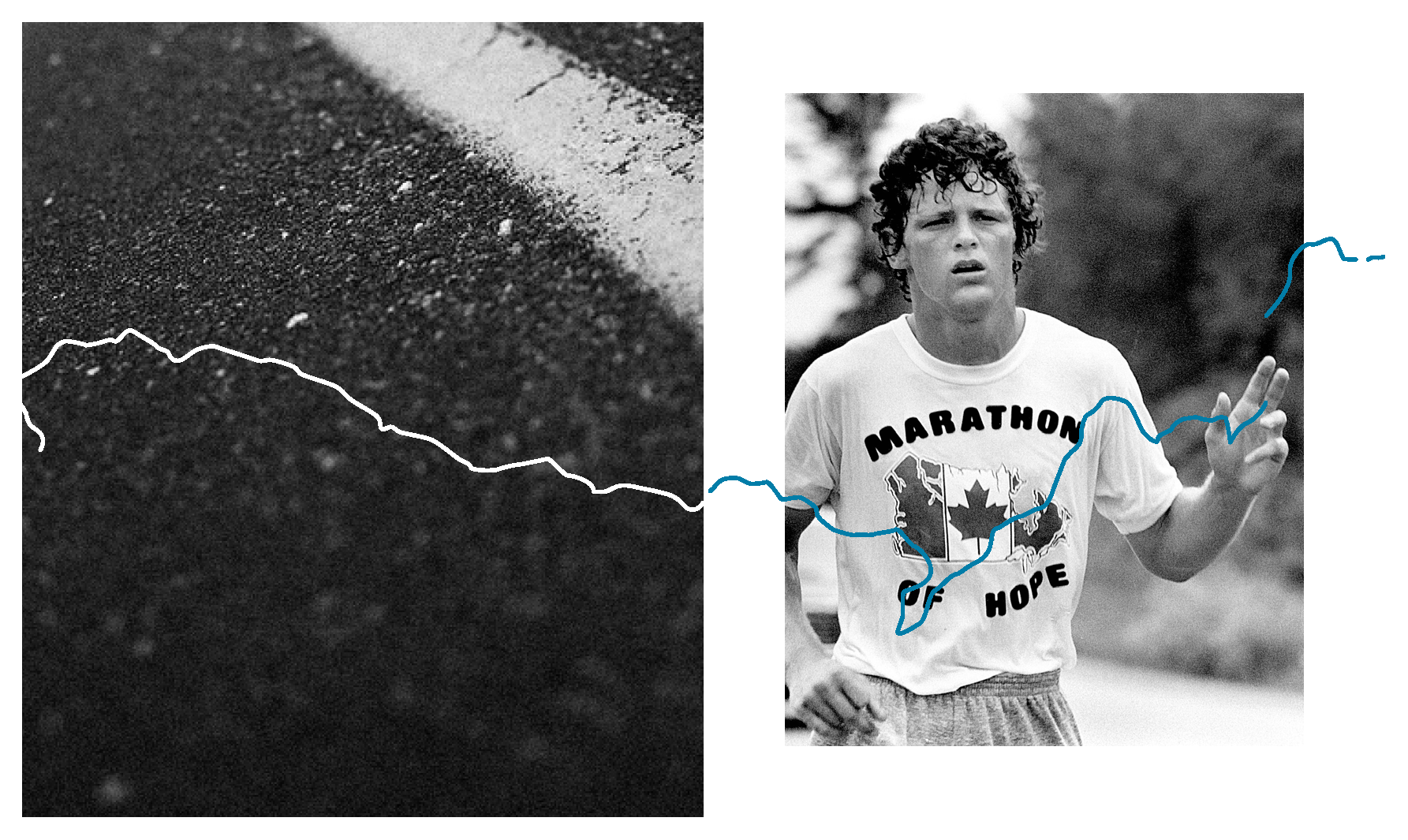
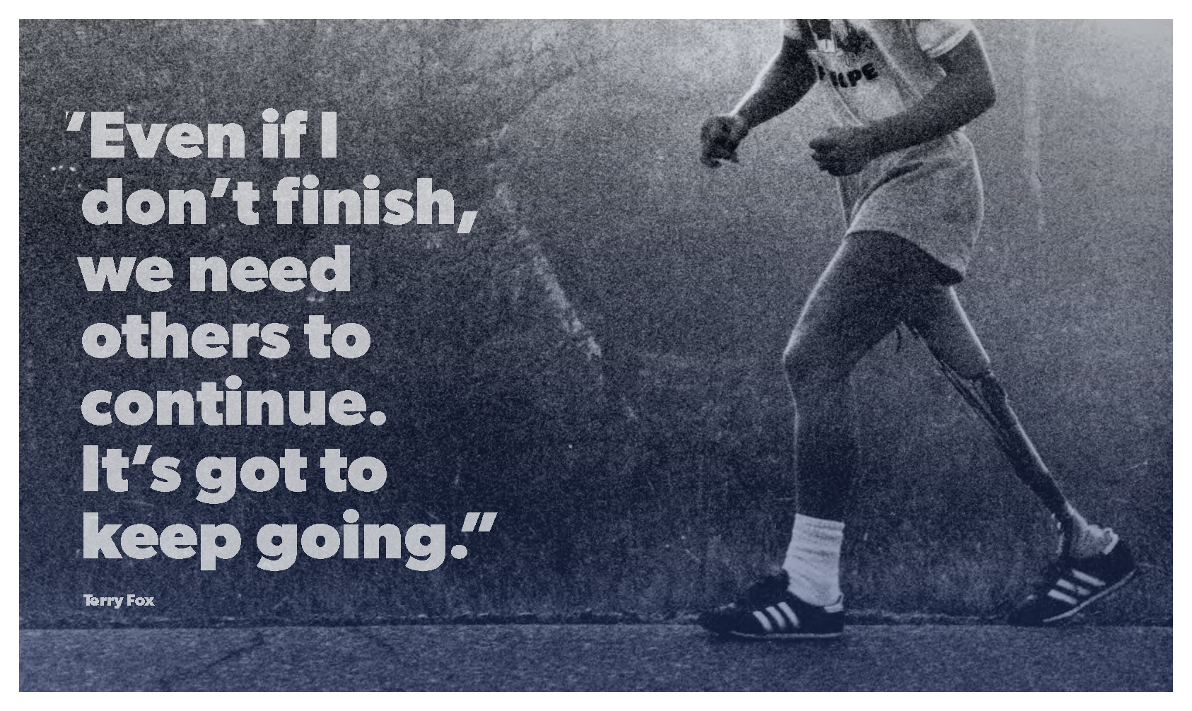
An incredibly passionate and dedicated team, they were looking to continue to spread their namesake’s original message, and their incredible accomplishments as a foundation across the country. Our team was able to work with incredible assets from Terry Fox’s world-changing Marathon of Hope, and help position the Foundation for years of continued relevancy. The subject matter made it easy — we leaned into Terry Fox’s background, drawing the colour palette from the clothes he wore, choosing a font as Canadian as he was, and keeping the message simple. We think that’s how he would have wanted it.
Logo design, art direction, and details from the part-brand-guidelines-part-inspiration-manual.
—
Client: Terry Fox Foundation
Produced at Grip Limited